Mediahuis wins with a multi-branded Design System.
What we did
The Client
Mediahuis is an international media company—and one of the largest in Benelux—with a wide range of cross-media brands. Through a variety of platforms, they give news consumers 24/7 access to the news source of their choice. Mediahuis is an ambitious and forward-looking company that has experienced rapid growth in recent years.
Pàu has been working with Mediahuis since 2019 . As the organization grew, the need for a design system became apparent. What do design systems do? They provide a shared library of reusable components and guidelines. Building products becomes much faster. The time the designers and the developers save in building products can then be put into other areas. Like better understanding users and their needs. Essentially, a design system is a single source of truth about your brand. It helps teams to design, realize and develop a product.
The Case
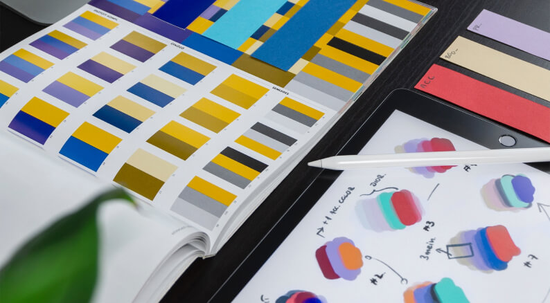
How could we set up a system to serve all of Mediahuis’ multiple brands? What’s their common denominator? And how could we create the building blocks (atoms) for this kind of brand? Font colors, spacing, and shades included. Fortunately, all these questions had an answer. And Pàu was ready to provide its expertise, advice, and talent!
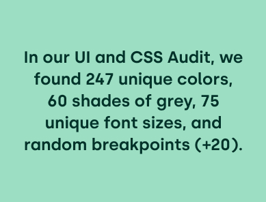
In our UI and CSS Audit, we found 247 unique colors, 60 shades of grey, 75 unique font sizes, and random breakpoints (+20). Nowhere near consistent.
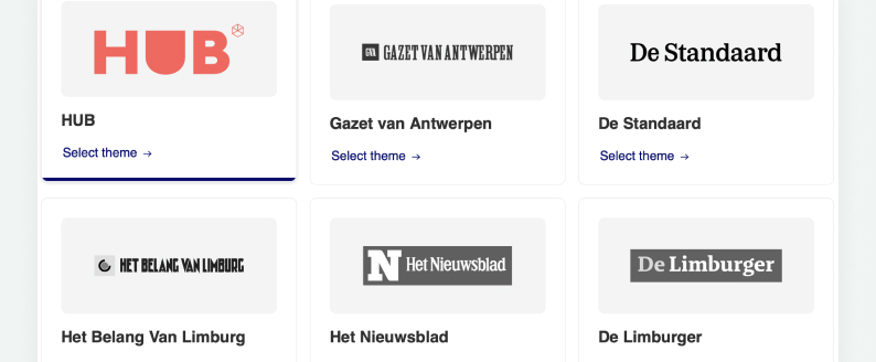
But then we also had to take into account that this wasn’t a case of developing a Design System for one specific brand, which is what usually happens. This case called for a multi-branded design system.
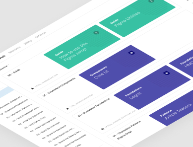
Chameleon Design System
Chameleon is a multi-branded design system providing ready-to-use tools and components for building high-quality, consistent user experiences at Mediahuis.
- Why Chameleon?
Because here, you have everything you need to start designing and building Mediahuis products, in one system. - Multi-branded
Exactly the same codebase for all Mediahuis brands. - Cross-platform
All branding values across all platforms are exactly the same, giving users a uniform experience. - Consistency
Not only do you get cross-platform consistency, but also cross-product consistency.
Mediahuis needed more scalability, and to be able to work more efficiently. Together with Mediahuis, we developed a multi-branded design system in the React framework. Because of the high level of adaptability, we decided to call it Chameleon.
Mediahuis had a very specific idea of the direction in which they wanted to go. Because they’re in the business of news, they knew that they wanted automatic article teasers and intros included.
But first, to create a consistent design across the board, the foundations need to be laid. These are then built on with the more complex aspects.
To put it more simply: users primarily use Mediahuis websites to view news. But what about the corporate page? And how about managing subscriptions? All of these aspects need to be taken into account too!
So we came up with the Foundations Model. This created the first steps towards the consistent design and efficient development.
The Foundations Model
- Code
Library of reusable code, development standards, and implementation guidelines - Brand Identity
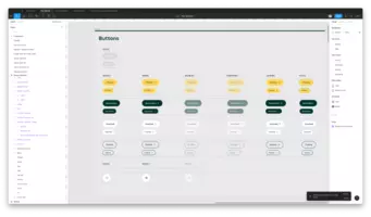
Visual identity, voice and tone. - Design Toolkit
UI components, patterns, pages - Design Guidelines
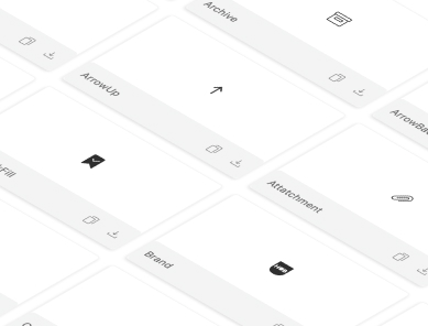
UX patterns, flows, Accessibility guidelines. - Foundations
Colors, typography, logos, icons, spacing, grid layouts, motion, shades etc.
We used what is called the “atomic design methodology” for this. Interfaces are made up of all sorts of components. The essence of atomic design is breaking them down into fundamental building blocks (atoms) and then working up from those foundations (molecules, organisms, templates, pages).
The key aspects were:
- An accessible color palette.
- A typography system
- An icon set
- Logos
- Illustrations
- Image ratios, spacing, shade etc.
We initially created a User Interface Toolkit in Sketch and Abstract, using Invision for prototypes. However as our libraries and files got larger we decided to migrate our designs to Figma, where we are able to collaborate on our files much more efficiently and where we can have all design deliverables in one place. As a finisher, design tokens (a way of capturing low-level values to create styles for an application in JSON format) created the bridge between design and development.
The Impact
The pilot project went live in August 2019. Have the results been good so far?
Of course! Here, we’ll let the figures speak for themselves!

How is Mediahuis reaping the full benefits of the multi-branded Design System?
We surveyed developers, designers, and product owners and they said:
The Conclusion
Thanks to Chameleon, the time involved in design is slashed, freeing up designers’ time for other things. Brand recognition is ensured across the board with a single source of truth. And all of this in a multi-brand environment.
